
My last few weeks in the city centre have allowed me finally to catch the new Stagecoach liveried buses in the flesh for the first time, and I have to say I am not that impressed!
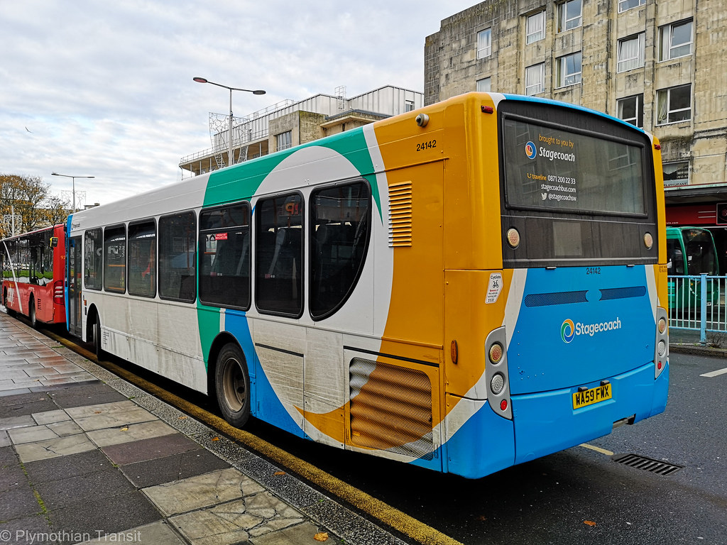
24142 shows just haw awful these look when dirty. Far too much white!

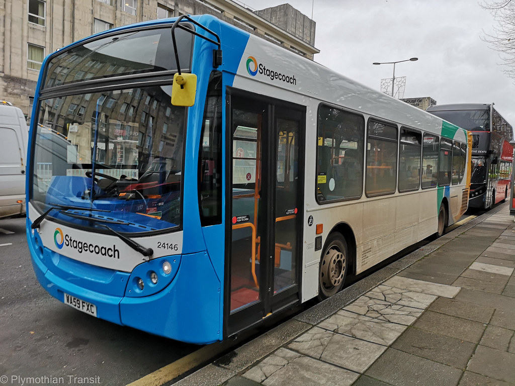
24146
26034
26035
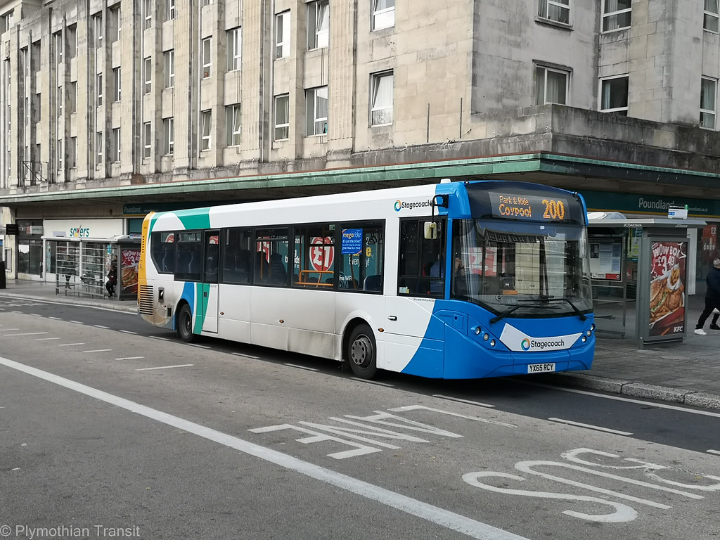
this smart livery looks so much better…
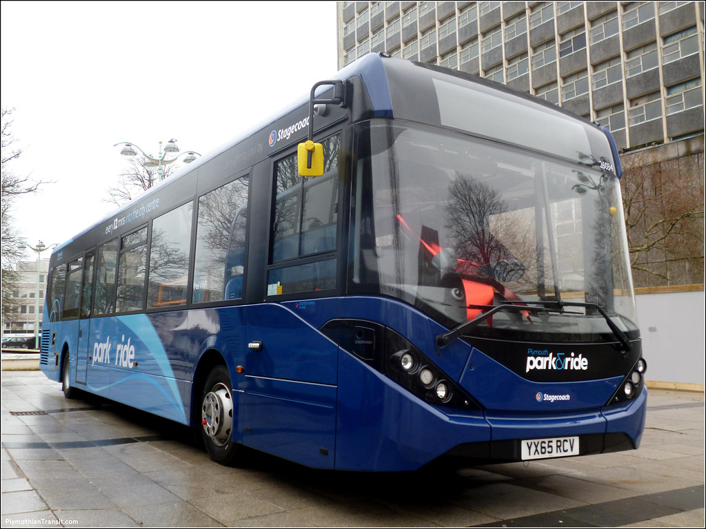
It has to be said that the white patch on the front of the MMC's is particularly dreadful. The E300s are no better either, considering the whole point of this rebranding was to get everything looking the same to my count there is currently 6 variations across the country.
ReplyDeletei was very disappointed that none of the single decks in their fleet kept their black band around the windows - i feel like this would have made them look smarter - and the white band at the front for the logo and especially on the E200MMCs the Blue band where it used to be black, isn't the best look!
DeleteAnt - I think it goes to show that with a bit of black paint the MMC's look new, but without it they look almost as old as the Darts and make the E300s look young. I've never been a fan of the MMC style it looks tacky, I prefer the older happy face look.
DeleteThe new livery has no redeeming features whatsoever. None at all. The comparative shots of the P&R MMCs proves it!
ReplyDeleteIt's a bad livery, I can't see it lasting more than a few years before Stagecoach admit it was a mistake. There's already various differences some having all blue fronts, others having yellow bumpers etc. This 'rebrand' is a load of nonsense. Stagecoach could have just simplified the old livery and saved wasting money that didn't need to be spent.
DeleteI quite like it. Better than the drab red of Citybus
ReplyDeleteCitybus livery looks especially drab when you compare it to some of the bright liveries that other Go-Ahead companies use.
DeleteI quite like the colours, but the application is appalling. That huge expanse of white on long single decks makes it look like dealer stock with a few vinyls slapped on.
ReplyDelete