
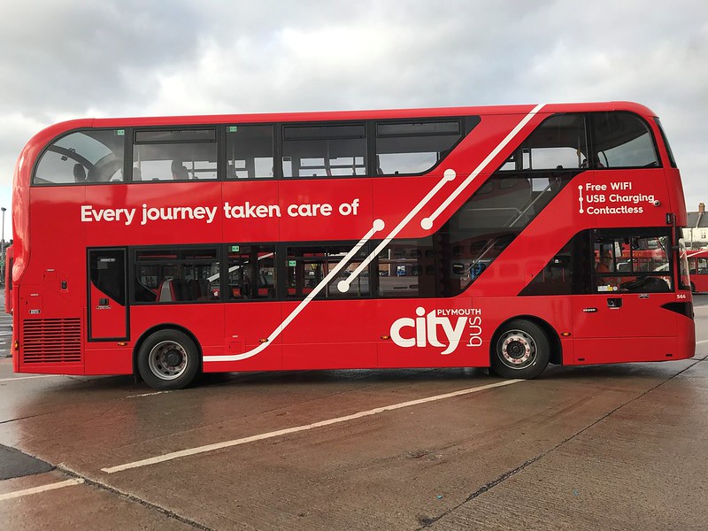
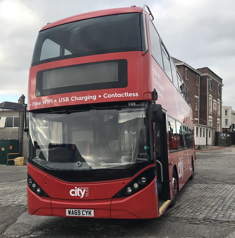
The new revised livery being applied to the new buses has been revealed today:

Well I like it. Its a more modern variation of the swoops which works better with the design of the bus and will also be less intrusive for passengers over the windows.
This is expected to be the new livery from now on, but its not known if this will be applied to the Yorkshire Enviros waiting to be dealt with at Milehouse.
So what do people think?
It’s just so boring, don’t you think?
ReplyDeleteAnd surely they could have made more of an effort with the ‘better for the air!’.....!!! Even a standard boot lid vinyl maybe? Such a shame.
Even though its a little bare, i quite like it. Very smart, minimalist, and if you look closely at the logo, you'll notice a few small changes there too. It'll be interesting to see what this looks like on the single decks, if they get applied - i've not seen the EYMS buses come out of the paint shop yet, so wondering if they will also be wearing this?
ReplyDeletepersonally, no i dont like it.. but is modern only part i like is that it tells you about the bus like cleaner air and USB charging
ReplyDeleteThis has to be yet another lame livery, only goes to show that PCB are a bunch of cheap skates, get rid of the lines/swoops and just have white fleet names on a background of red,
ReplyDeleteIts a lot better
ReplyDeleteErrrr, to put it politely its rubbish. Cheap, tacky and nasty. I predicted years ago that the flash branding wouldn't last, This won't last more than 18 months.
ReplyDeleteFlash branding "wouldn't last" what do you mean? It has lasted 6 years and has attracted many more customers! If anything I would say it was a success and I feel the Spark is following in the same footsteps bringing more customers to the market.
DeleteI have to admit these buses would've been better done up as "sparks" in the livery identical to that already used (with the branding for the 50/51 or other routes they are intended for) this would not only keep the buses in a semi-standard livery where you can interchange them as spares with only a small amount of lettering shows the bus is off route but would also keep branding alive on select route in Plymouth attracting new passengers to the service and being more of a premium style of route!
Yeah it might have been kept going for 6 years, but the original routes that where branded for Flash are no longer flashes, the only one that was upgraded being the Spark brand, the past 3 years the flash branding has basically been dead, it got so messy than PCB finally pulled the plug since the B7RLE's are going and the E400s are no longer on the routes they are painted for.
DeleteWe dont know if the Spark brand will be staying yet either though.
DeleteSpark will be staying as far as I am aware!
DeleteI think it is a vast improvement over the old livery, it is simple yet it stands out! Just what you want from a livery! I think it adds more character to the buses and reduces one of my key hates about the past livery where there was alot of details on the lower deck and the upper had way to much negative space. I feel if this livery is applied properly it could prove effective on single decks too making a vast improvement overall to the presentation of the company.
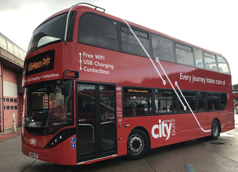
ReplyDeleteI can't wait to photograph these on Friday in preparation for their launch! Seems like 566 is keeping it's astor "100" destination blind too with other destinations already loaded alongside it!
How come the destination blinds are back to orange LED's again? The white looks better and stands out
ReplyDeleteAbsolute rubbish. Reminds me of the National Express branding.
ReplyDeleteIt's very London, isn't it? Really not sure about it. Looks smart given it's fresh, but red does wear quickly and it could up looking rather drab. If they were deliberately going for simplicity to reduce costs I'd have ensured the the white vinyls didn't intrude on to the skirt panels.
ReplyDeleteDisappointing about the orange LEDs.
Not a patch on their Cornish neighbours at First
ReplyDeleteAwful. First in Cornwall and Stagecoach standard livery is way better
DeleteThese buses are confirmed as for 42s and PR3. Full explanation on CityBus website
ReplyDeleteRichard Stevens from Citybus posted a video on facebook about the new vehicles, and confirmed they are for the 42 group and PR3.
ReplyDeleteTotal lack of imagination. Even a different colour band in between the lower and upper deck windows would be something. A cream band would be good.
ReplyDeleteNot for the 50/51 routes but 42's & park & ride
ReplyDeleteThere's been no real time tracking on the 42s today (8/12), so many people have been left confused and cold! Hope that gets sorted soon.
ReplyDeleteAnyone see the Yellow Flashes opperating on the 42 today?
DeleteThat’s where all the high price bus fares go
ReplyDeletewhats going on with the norwich busses?
ReplyDeleteis anything going on with the Norwich buses?
DeleteDo they mean Yorkshire?
DeleteI meant the new E200's haha forgot where they came from lol
ReplyDeleteTwo more of the Volvo Wrights have now departed for Manchester. I believe they are 103 and 106.
ReplyDelete