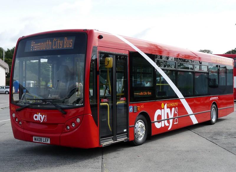
That's smart. I liked the previous new livery but this is actually better still. The fleetname looks to be an improvement even though I'm not convinced about the 'bus' being vertical.
Whilst I like the elements of the previous livery being retained and the elimination of the dark red, what exactly is the point otherwise? There seems to be greater scope for difficult repairs in the event of skirt panel damage.
Overall it seems a pointless tinkering with the Stenning livery.
In term of skirt panel damage etc this is a lot easier than previous liveries as everything is just painted red. The white swoop and the fleetnames are just stuck on afterwards. Couldnt be more simple to produce. I was never convinced about the dark red front - this livery is so much brighter.
Not bad at all. However the super-sized slogan is too large and does currently overpower the rest of the livery IMHO.
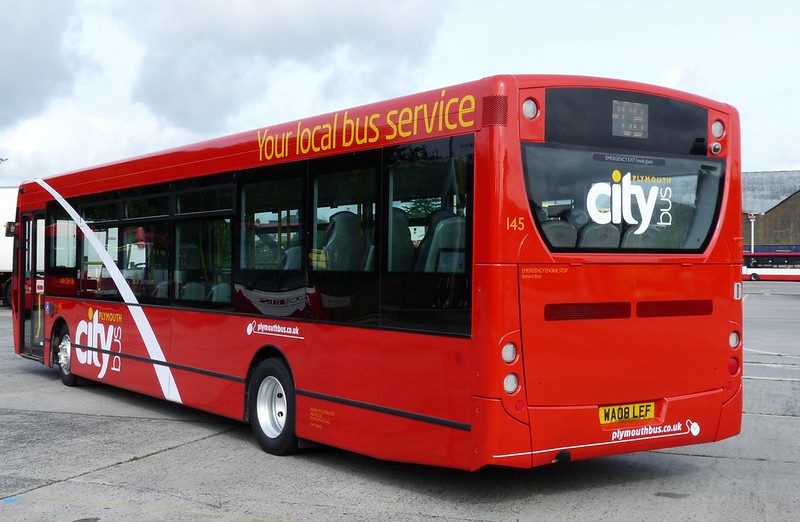
Just noticed that this scheme doesn't make the application of side advertisements any easier, but that may also explain why the rear has been left intentionally blank.
i like it for its simplicity and the bright look. the logo is the right size so as to advertise the company. the bodyshop and paintshop must be congratulated for turning out such excellent quality paint finish and design. can't wait for them to do my bus nxt yr!
A backwards step from the Best Impressions versions. Looks naff and botched together - the Stenning version worked well - this looks awful. How ridiculous that the livery has changed yet again. New MD wanting to make his mark I wonder!?
Have something interesting to say? Please share it here!
(Moderation is currently switched on so please allow a short while before your comment appears on the site. This is only to cut down on spam - not to cut out people who disagree with me!)

That's smart. I liked the previous new livery but this is actually better still. The fleetname looks to be an improvement even though I'm not convinced about the 'bus' being vertical.
ReplyDeleteIs it the same shade of red being used?
Lose the "swooper" and it will look super!
ReplyDeleteWhilst I like the elements of the previous livery being retained and the elimination of the dark red, what exactly is the point otherwise? There seems to be greater scope for difficult repairs in the event of skirt panel damage.
ReplyDeleteOverall it seems a pointless tinkering with the Stenning livery.
In term of skirt panel damage etc this is a lot easier than previous liveries as everything is just painted red. The white swoop and the fleetnames are just stuck on afterwards. Couldnt be more simple to produce. I was never convinced about the dark red front - this livery is so much brighter.
DeleteCouldn't be more simple to produce? With all that vinyl to match?
DeleteNot bad at all. However the super-sized slogan is too large and does currently overpower the rest of the livery IMHO.
ReplyDeleteJust noticed that this scheme doesn't make the application of side advertisements any easier, but that may also explain why the rear has been left intentionally blank.
I shall miss the dark red I liked it more and gave a bit of individuality from other liveries in Plymouth.
ReplyDeleteVery nice, i like it, lots of red! Now they need to get the whole fleet into this new livery asap
ReplyDeletei like it for its simplicity and the bright look. the logo is the right size so as to advertise the company. the bodyshop and paintshop must be congratulated for turning out such excellent quality paint finish and design. can't wait for them to do my bus nxt yr!
ReplyDeleteTypical Plymouth Citybus paintjob! Naff & pointless, no wonder why citybus are going downhill!
ReplyDeleteWhat did you expect flames? Go faster stripes? Chromed exhaust pipes? Racks of spot lights on the roof?
DeleteThis Livery deserves no Praise, will Substantiate that Comment if Required
ReplyDeleteA backwards step from the Best Impressions versions. Looks naff and botched together - the Stenning version worked well - this looks awful. How ridiculous that the livery has changed yet again. New MD wanting to make his mark I wonder!?
ReplyDeleteA vast improvement on the Stenning horror. The dark red was really dreadful.
ReplyDelete