The first of an occasional series where I select my own top five and dare you to disagree with me! (surely not?)
This time we look at Plymouth Citybus liveries (standard liveries rather than any promotional schemes) so counting down to my number one Citybus livery …
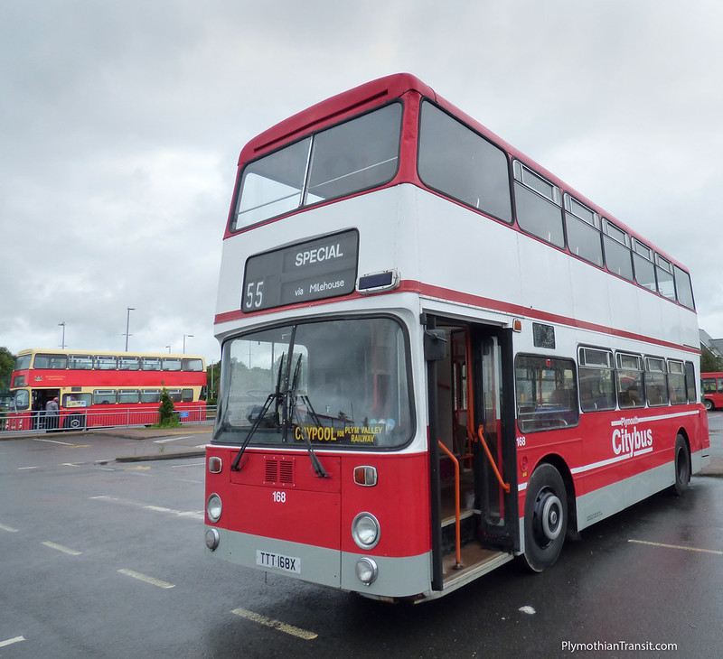
Five
Never a real fan of the grey skirt. but a clean tidy livery
Four
When freshly applied this was nice modern take on the traditional red and cream
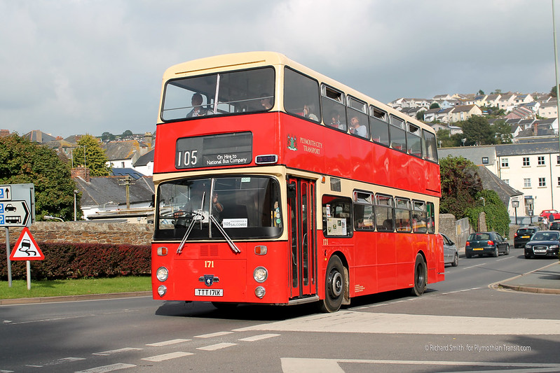
Three
When fully lined out this livery was superb.
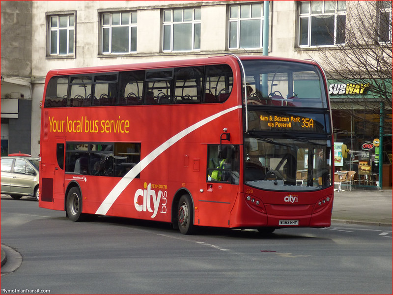
Two
I know a lot of people dont like it but I love this new scheme. Clean and crisp and unique to Plymouth.
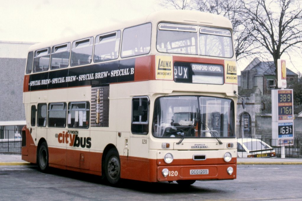
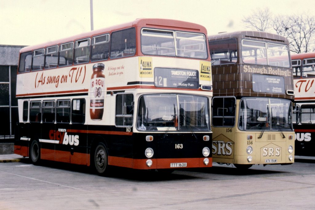
One
Another livery which divided opinion at the time was this black and red scheme. The red skirt was a later addition to the original mainly black scheme and it worked a lot better for it. I actually liked it without the skirt too, but this was a nice bold update.
© Ian Kirby
So am I right or am I right?
Have I missed anything which should be listed here? (Maybe someone out there liked the maroon lake livery? I know its unlikely but you never know…)
Please let us all know what your favourites are - and more importantly why its your favourite!

a very nice list, but i feel that the gold swoop citaro 85 could be on this list, as its not an ad? what you think
ReplyDeletebut its still a one off promotional bus - although I do like it!
Deletei use the 408 and 409 a lot to collage and i do like the blue and red swoop livery on them, but are they classed as ad livery? also you have picked almost all the good ones as im myself is not much of a fan of the livery on 171.
ReplyDeleteI do think the swoop is bold clear and unique. To young to remember some of the other liveries but the plan red looks good on the vintage bus that had operated on running days from coypool.
ReplyDeleteOn a slightly different tact, Citybus bus 30 is on service today on the 35 (and I presume the interworkings).
Some odd things going on too, but I guess it's too do with vehicles in workshops 140 has been on 8/9/23/24, 91 in on 42C (I know 102 is still off the road), 436 and 520 both in on 50s, 483 on 33 but nice to see an older vehicle doing a long run, 19 has been on 46s today.
The black was brave but didn't quite work somehow - I preferred the light grey which replaced it, if I recall correctly. Not a fan of the white swoop (sorry!). Mind, nothing comes close to the old City of Oxford crimson, blackcurrant and light green livery!
ReplyDeleteI did, however, like the old (pre-GoAhead) Wilts & Dorset livery of orangey-red, white and black on an Optare Spectra. (Sorry, off the subject of Citybus liveries, I know!)
DeleteThe Ray Stenning maroon - swoop - red livery looked very good on the Wright-bodied Volvos because it was relieved by chrome at the front; the same livery looked dreadful on a double-decker. I think that, if the maroon had been a lighter shade, to might have looked better.
ReplyDeleteI am afraid I think your first choice looks cluttered - and black in any quantity is depressing. The recent red and white livery looked good on single-deckers, especially on the itaros - although the Darts were improved by making the window surrounds black.
Somewhere, but goodness knows where, I have got a picture of a green VR in Western National Citybus livery - from the long-lost days of 'Catch any bus - red or green'.
Swoop ahead of the lined red?!! You must be mad!! As for unique, it feels like every other company now has that darn swoop up the side, spoiling otherwise decent liveries! I rather liked the red with darker red/maroon front livery the Wright Eclipses came in. Glad to see the rubbish red skirt with red up the front corners livery we had a few years ago wasn't on the list! Guess that's the fun thing about tastes, we all vary so! :-)
ReplyDeleteNumber 4 is my favourite closely followed by number 3.
ReplyDeleteas you know graham i used to own TTT 168X. my plan was to put it into the red black and white scheme, as i used to remember it, and looked really crisp when straight out of the paintshop.
ReplyDeleteTop of the list would have to be the 1982 red and cream, which introduced the Plymouth Citybus fleetname. It still looks good even now but whilst to modern eyes it will inevitably look rather traditional, back in 1982 it was quite revolutionary and caused quite a stir. It was undoubtedly a couple of years ahead of its time, just because of that upturned swoop at the rear. How times have changed!
ReplyDelete2. Today's red with a white swoop, for exactly the same reasons as Graham.
3. The previous Best Impressions maroon and red. It wasn't perfect and it looked awkward on some body styles but quite stunning on the Eclipses. Let down by the dark front end and the overly fussy fleetname style.
4. Traditional lined out red and cream
5. The red and white with grey skirt, as per 168 above, although I hated the pre-Best Impressions red/white 'blocky' style as it bore no relation to the bodywork and had no 'flow' to it. I wasn't a fan of Graham's #1, the black/red/white either - it was better with the red skirt but there was too much black and it looked rather severe, stern almost.
Well I didn't dislike the maroon lake - maybe I'm a bit of traditionalist if anyone needs a reminder www.flickr.com/photos/41585621@N08/9540266420/
ReplyDeletePersonally it's no 3 for me.
ReplyDeleteThe 2 Green Flash deckers (another livery!) are out of the paint shop and should be in service very soon. Red Enviro 400 no. 504 (the Heart FM bus) has been involved in a collision with a lamp post in Plymstock and quite badly damaged.
Whoops! Where did it happen in Plymstock? What damaged did it do?
Deletei would add to the list the red and white and cream that dennis dart 10 has with that type logo but really 168 is a lot like it but i was really a fan of those flat floor darts
ReplyDelete537 in service today, 16th February 2016, in Green Flash livery. Saw it on Exeter street just before 1pm.
ReplyDelete537 looks ok actually, saw it this morning aswell! When are the New red ones due to enter traffic? Only them left now
DeleteIf I'm honest I quite like the swoop on the E400 fleet
Super Park & Rider I Would Add... i like the yellow and green livery they put on the darts and 709ds
ReplyDeleteYes I liked the green and yellow livery too, but they didnt always get it right, dont forget the Park & Ride fleet were grey once!
DeleteAs were Exeter's!
Delete